The Entitys and Institutions of the African Union play a key role in the implementation of the mandates of the AU and continental programmes and initiatives aimed at promoting Africa’s vision of sustainable and inclusive growth and development.
Being constituent part of the larger body that makes up the African Union, it is key that the brand identities of the Entitys and Institutions are aligned with the Corporate Identity to ensure that all stakeholders identify them as being part of the African Union working in service for Africa’s citizens. This visual style and guidelines represent identity and the framework for presenting The AU Entitys brand internally and externally.
This visual style guide provides the framework for how the iconography of the Entity / Institutionn is to be used in all communication material and in adherence to the overall brand identity of the African Union.
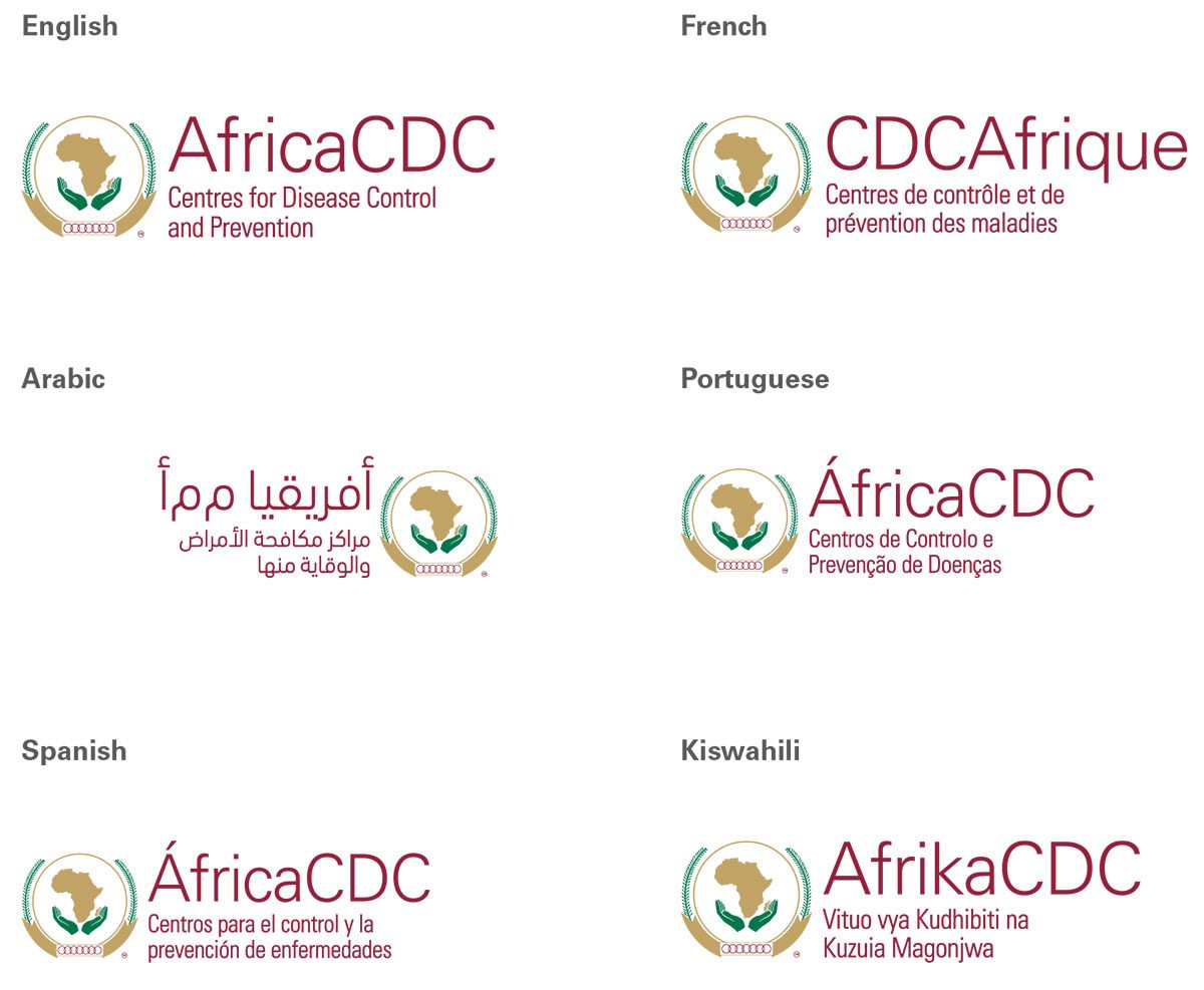
The logos will be available in the six official African Union languages: English, French, Spanish, Portuguese, Swahili & Arabic.
This communication style guide is a living document and your feedback will assist in its refinement. We hope you enjoy using this guide and receive great value from it to ensure we build a stronger brand identity for the Entitys and the AU.
Break Down of Entity Logo Design
The Entitys logo are a combination, in one fixed-size in relation to of the African Union emblem. The Entity logo is the keystone element of the identity programme and should be used to represent the entire Entity.
In practical terms, the deep green colour and various shapes designed within the negative space make the logo strong and distinctive. It is designed for easy application to the variety of print and online materials that represent the Entity and their African development experience.
Design wise, the Entity logo has been broken down with a number of factors in mind:
- Abbreviation Title The font for the title used is Univers 45 Light 105pts in size, with a leading of 1266pts (This being a reason so as to accomodate other Entitys that may have long titles)
- A few factors in the design of logo have to remain constant owing to the fact of tying it directly to the Mother Brand of the African Union while ensuring that for visibility purposes the Entity remains easily identifiable as an entity
Entity Logo Language
The Entity Logo’s will come in the 6 official languages of the AU i.e English, French, Portuguese, Arabic, Spanish and Kiswahili.
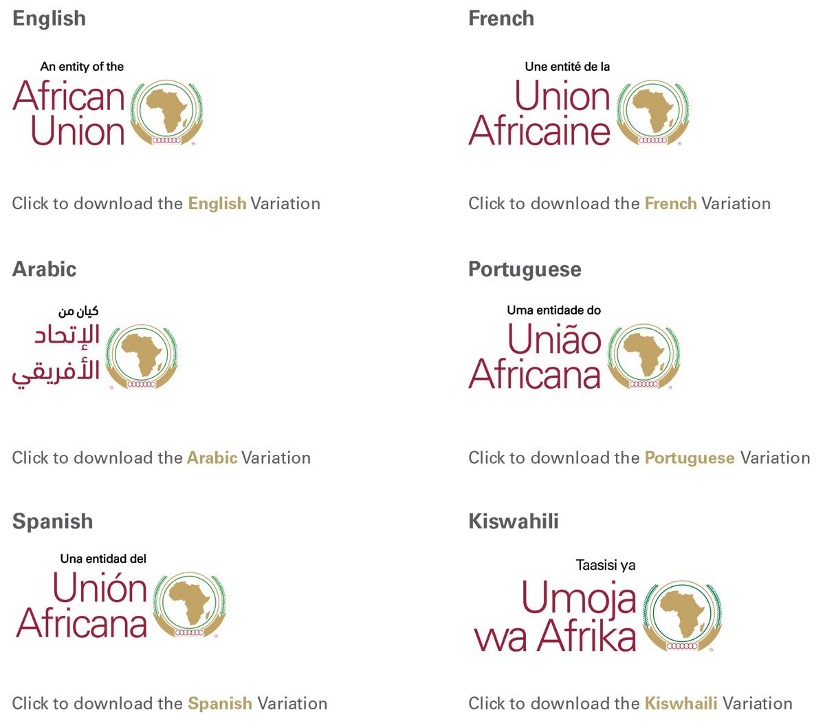
AU Entity signoff
When Communicating the Entity, the AU signoff includes a clear indication of being an Entity of the AU. This should always be placed first in the bottom left corner of any document or design.
The African Union Sign off Logo will come in 6 different languages i.e English, French, Portuguese, Arabic, Spanish and Kiswahili.
The African Union Sign off Logo is the one element that unites and represents our Entityization. It has been specifically designed to symbolize not only our name, but also what we stand for – AFRICA. The lower case letters used in the logo are friendly and approachable.
The African Union Sign off Logo should be used as an indivisible unit and its integrity should be respected at all times. Placing the AU logo on any materials (including partnerships) represents AU’s endorsement of its contents.
The Entity Logo Colour Variations
- There are only six versions of any Entity logo and Tagline: English, French, Portuguese, Spanish, Kiswahili and Arabic
- There are only 4 Colour Variations of the Entity Logo: Full Colour, Greyscale, Black and White
- The Entity logo and tagline must always appear together for generic branding in the appropriate language.
- Each Entity Office will decide for itself which language version of the logo and tagline to use, based on the country-specific circumstances.
The Entity Logo Colour Variations
The Entity/ Institution Logo should be displayed only in their approved colours. The examples shown here illustrate the correct use of the logo in positive formats. The preferred ways to display the logo are:
- Full color over a light image (Image can be lightened up by applying a white to transparent Gradient behind the logo)
- 100% white over AU Red
- 100% white over AU Green
- 100% white over AU Gold
- 100% white over a Dark Image (Image can be Darkened by applying a black to transparent Gradient set on multiply and opacity at 40% behind the logo)
All logo files and templates are available from the Brand Team in the Directorate of Information & Communication.
Variances of Logo that are not permitted
- Do not place the logo on backgrounds that provide little contrast or legibility.
- Do not superimpose the logo on any image or decorative pattern that obscures its readability.
- Do not place a full color logo over a photo/ background that interferes with its legibility.
- Do not retype the text component of the logo.
- Do not redesign, recreate, distort, add or change any elements of the logo.
- Do not alter the proportions of the logo.
- Do not use the logo, or any of its elements as a tinted background or decorative element.
- Do not add special effects to the logo (drop-shadows, outlines).
- Do not use clipart or logos found in the internet.
- Do not use scanned art.
- Do not use outdated versions of the logo.
- Do not print the logo in metallic inks (gold, silver bronze).
- Do not use the logo’s typography or the icon as a separate visual element.
- Never separate the visual components of the logo. It is designed to be a single and cohesive single signature.
- Do not display the logo truncated or incomplete.
- Never use the logo as a decorative element behind typography.
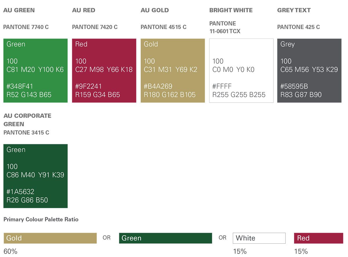
Primary Colour Palette
The primary colour palette consists of AU Green, AU Red, AU White & AU Gold . These colours should always dominate any layout to ensure the brand remains recognisable. They can be used in the visual language system throughout the Entity communication.
Spot: Where cost is not prohibitive it is preferred that the Pantone MATCHING SYSTEM® spot colour alternatives are used.
CMYK: The CMYK (process colour) specifications are to be used for processes where spot colour is restricted. For example in magazines. RGB: The RGB (monitor colour) equivalents are only for electronic use. For example in television and audio- visual presentations.